For the third prototype I started looking for a professional printer. In an ideal world, I would have found a way to screen print the book and use gold for the yellow – but for now, there are no professional screen printing studios in Romania – the only ones I could find were either printing on t-shirts or private-run studios. The second best option would have been an offset print, preferably in pantone colours – but my goal was to print about 50 copies, and offset becomes viable from about 700 copies upwards. So it was going to have to be laser/led printing.
This was the first prototype to be ”true to digital format” – 16,5×23,5cm.
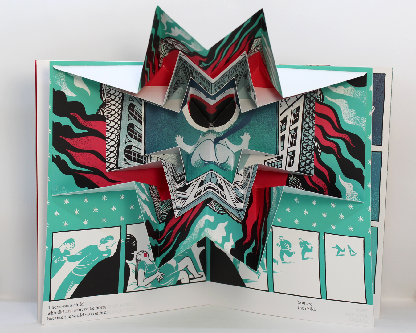
I knew that I would have to glue the pop-up inserts myself, since that would be a long, laborious and expensive process, but I wanted to find someone to print and cut the pages for me. I was also looking for a solution for the cracked white line in the middle of the spreads. I contacted a long-time collaborator, and they suggested using a microfilm on the pages. We ended up printing a prototype on 350g double chalked paper, and this remains the only prototype without a white line in the middle. I also learned about the ”kiss cut” which is cutting halfway through the paper, for an easier, cleaner fold. I glued the spreads together by hand, using double sided tape, and then the block was cut with an electric guillotine.
While I loved the end result, it did have a few issues that proved to be impossible to ignore. First, you cannot use microfilm on a paperweight lower than 160g – which meant either very thick paper for the pop-up-inserts, or a change of paper in the middle of the book. Also, since it is essentially a smooth plastic surface, you can’t really glue things to micro-film. I also discovered the double sided tape was visible as a row of fine gray lines on the edges of the book. The final book was incredibly heavy.
And so, I moved on the prototype 4.
And then I came back later and changed the text – if you look closely at the images, you’ll see I used self adhesive paper to change the text block from all caps to lower case – something that really, I should have done way sooner. You will also notice that the shade of blue-green varies greatly between prototypes – we’ll talk more about the pain of colour profiles later. Know that I suffered, mostly due to my own ignorance :).