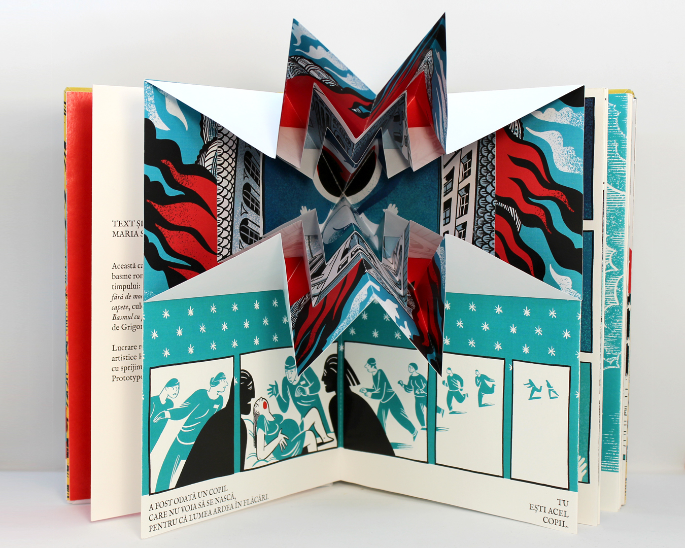
The Romanian edition was printed at home in my studio, on 200g Fabriano Accademia paper. I wanted to test the idea of printing the book out as an accordion, so I searched for large sized paper and found a 1,5x10m roll. In was in the background of my zoom calls for a very long time. My laser printer could print 1.35 m banners, so it still meant I had to glue several pieces together. I used the kiss-cut I had just learned about for the folds to minimize the dreaded white line, then just glue the spines together. The final format was 16,5×23,5 cm, and it proved to be particularly challenging, especially in relation to the pop-up elements. I had to glue the Turkish fold pop-ups from two different pieces, since a 33×33 cm paper was too wide for my printer. The lesson I learned from this was that I would rather NOT print the book at home. Still, the Accademia paper had one thing going on for it – since it had a slight texture, it mitigated the very shinny laser printer effect.
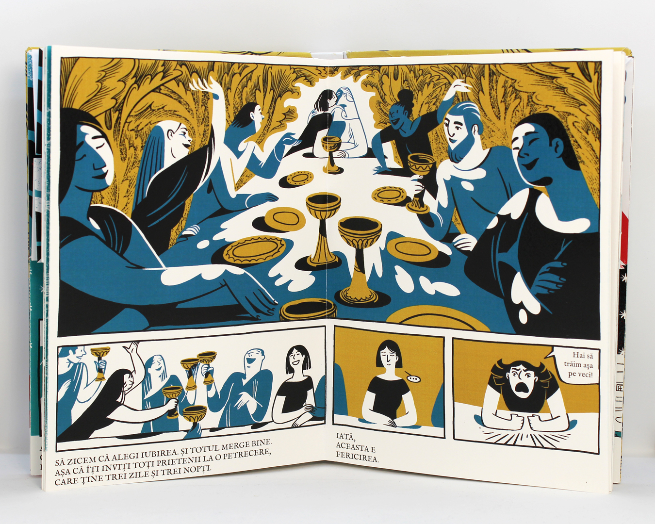
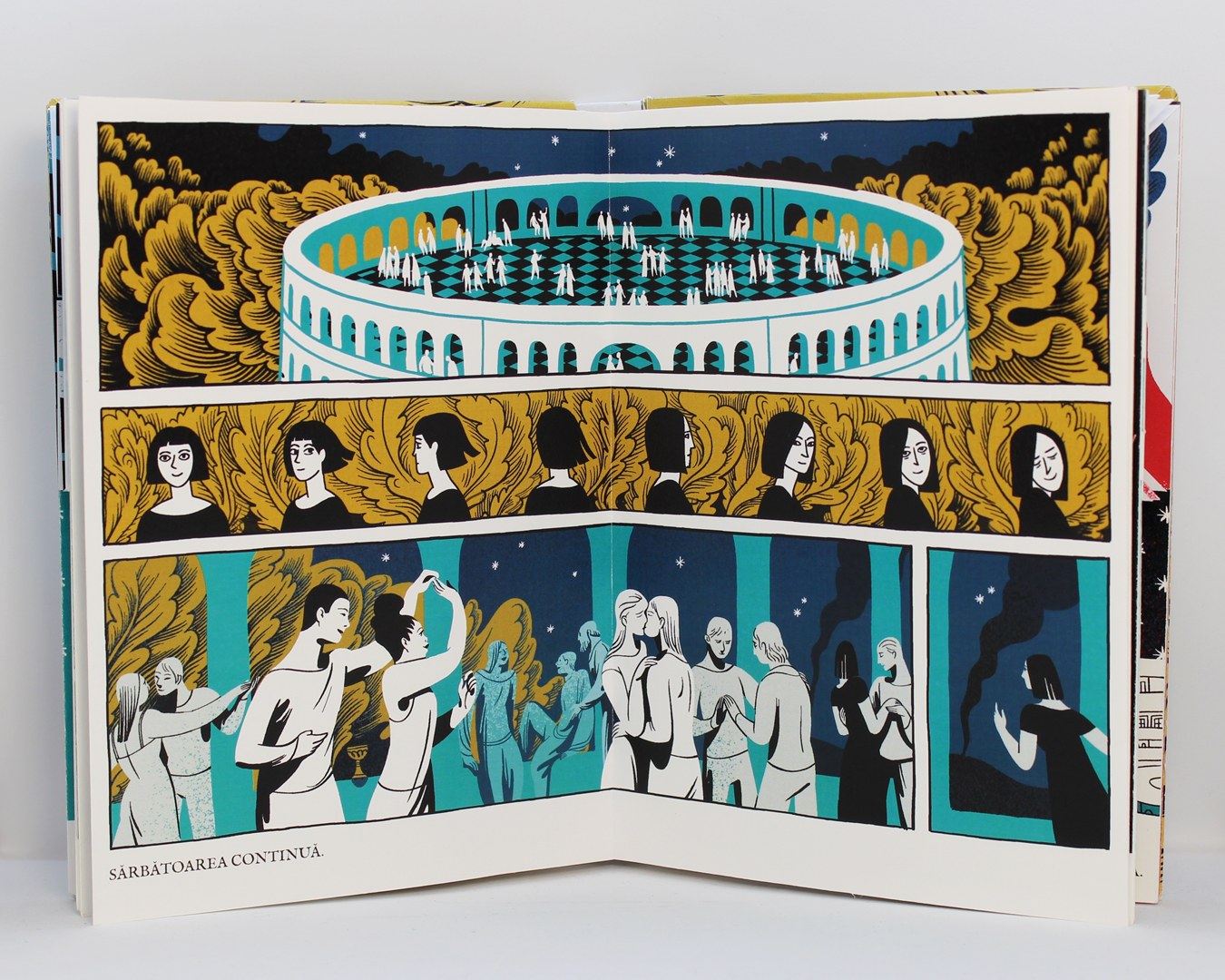
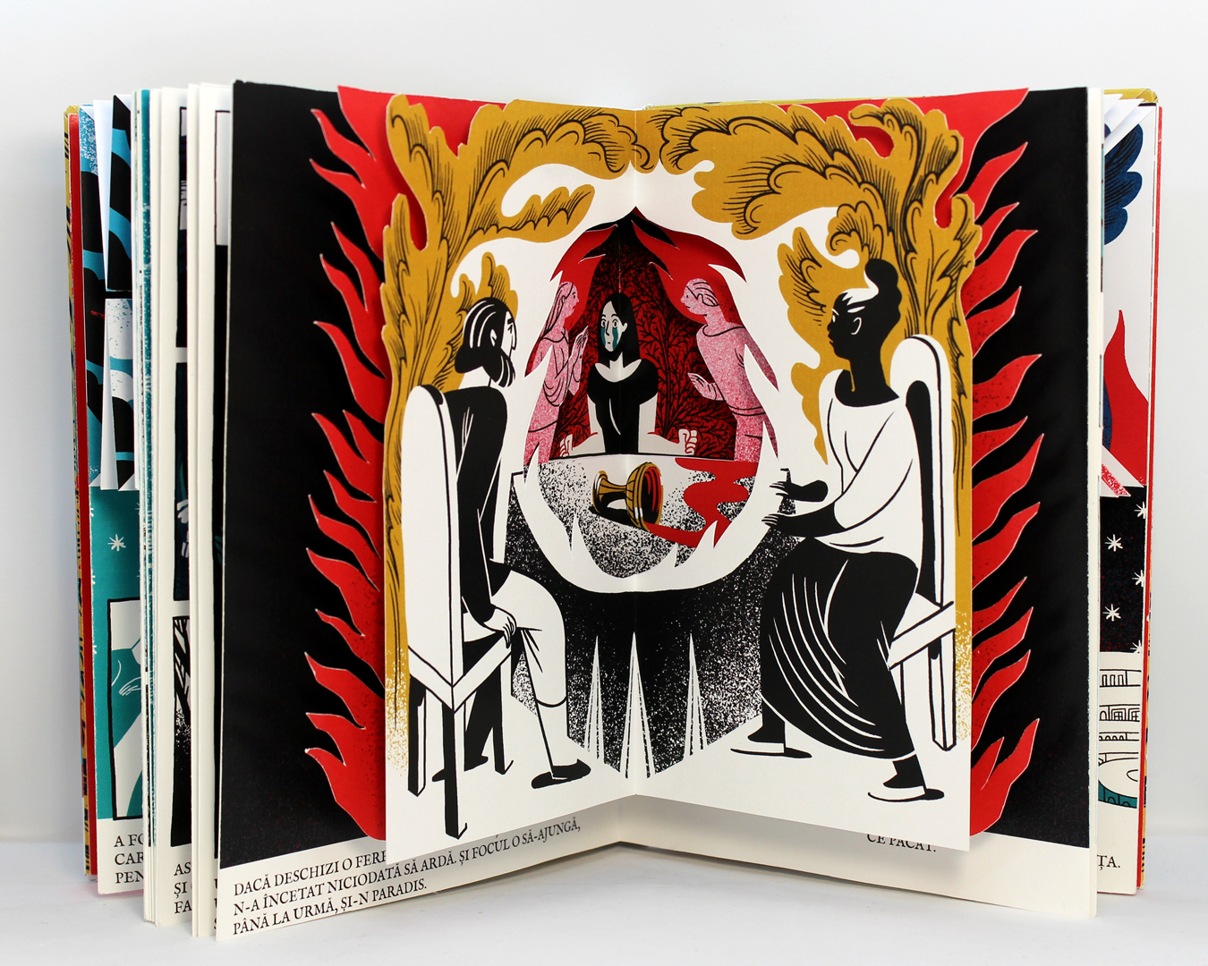
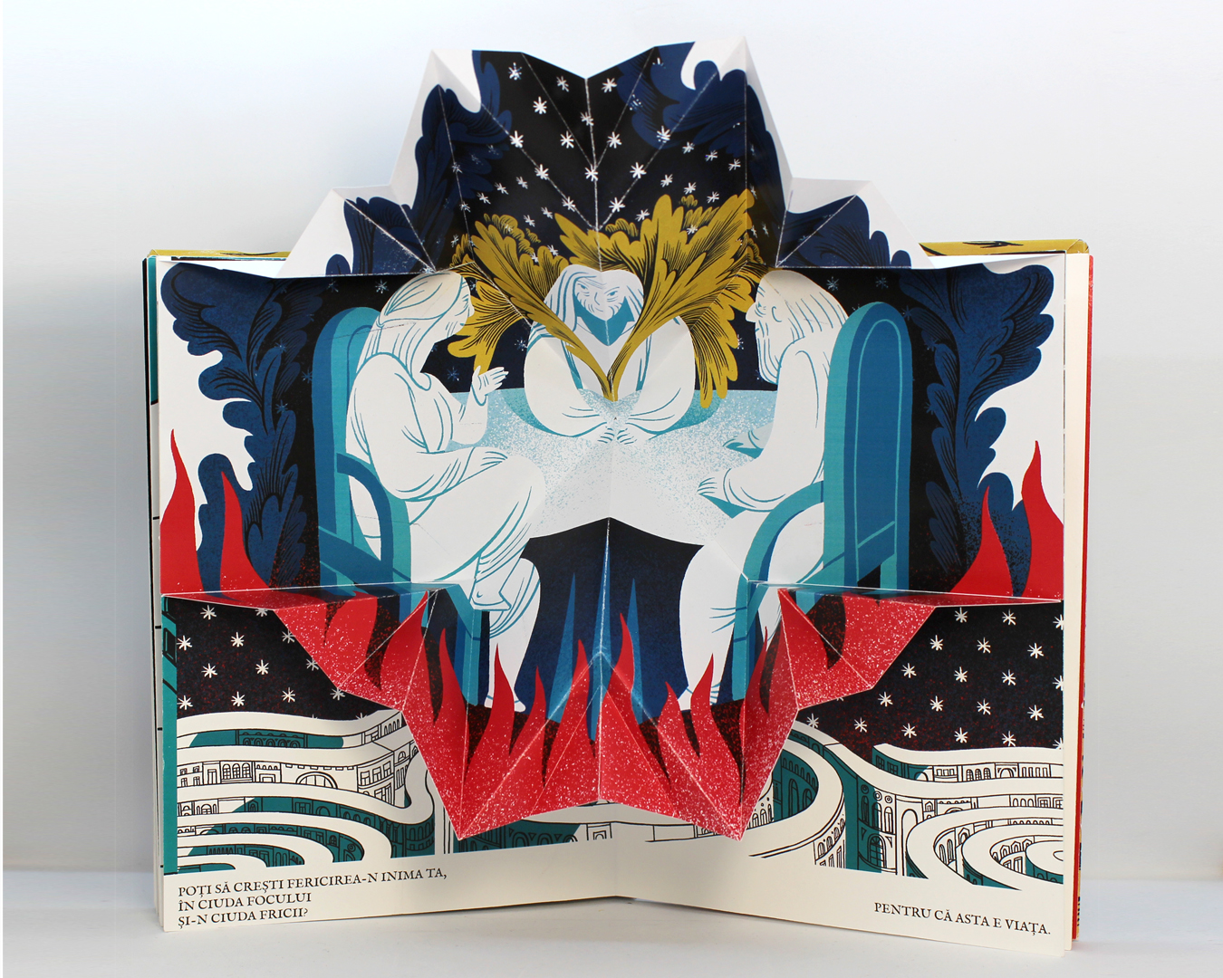
Around this time I reached out to the first batch of beta readers (my family) and got the following feedback. The all caps text was jarring – my mother politely explained that she had seen this type of lettering on angry comments on Facebook. My sister pointed out that the book lacked diversity, which became a problem if the book was depicting ”paradise”. I pointed out that I had both black characters (but I was not putting in skin tone as a stylistic choice) and gay characters in the ballroom scene, to which she answered, ”it does not work if only you know that”. She was, of course, right.
Changing the all caps text proved more difficult than expected (it was not, I was just second guessing myself and my belief that the original font worked just fine in regular form). I felt the time was right to consult with a real graphic designer, and reached out to Alice Stoicescu, whom I had met through Visual Playground. She agreed that the font was a good choice, but she suggested changing the placement of the text on the right handed pages to make it more easy to read and disrupting the text in the speech bubbles.
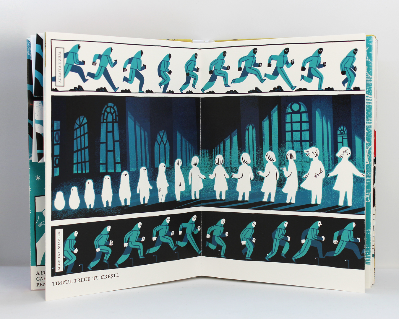
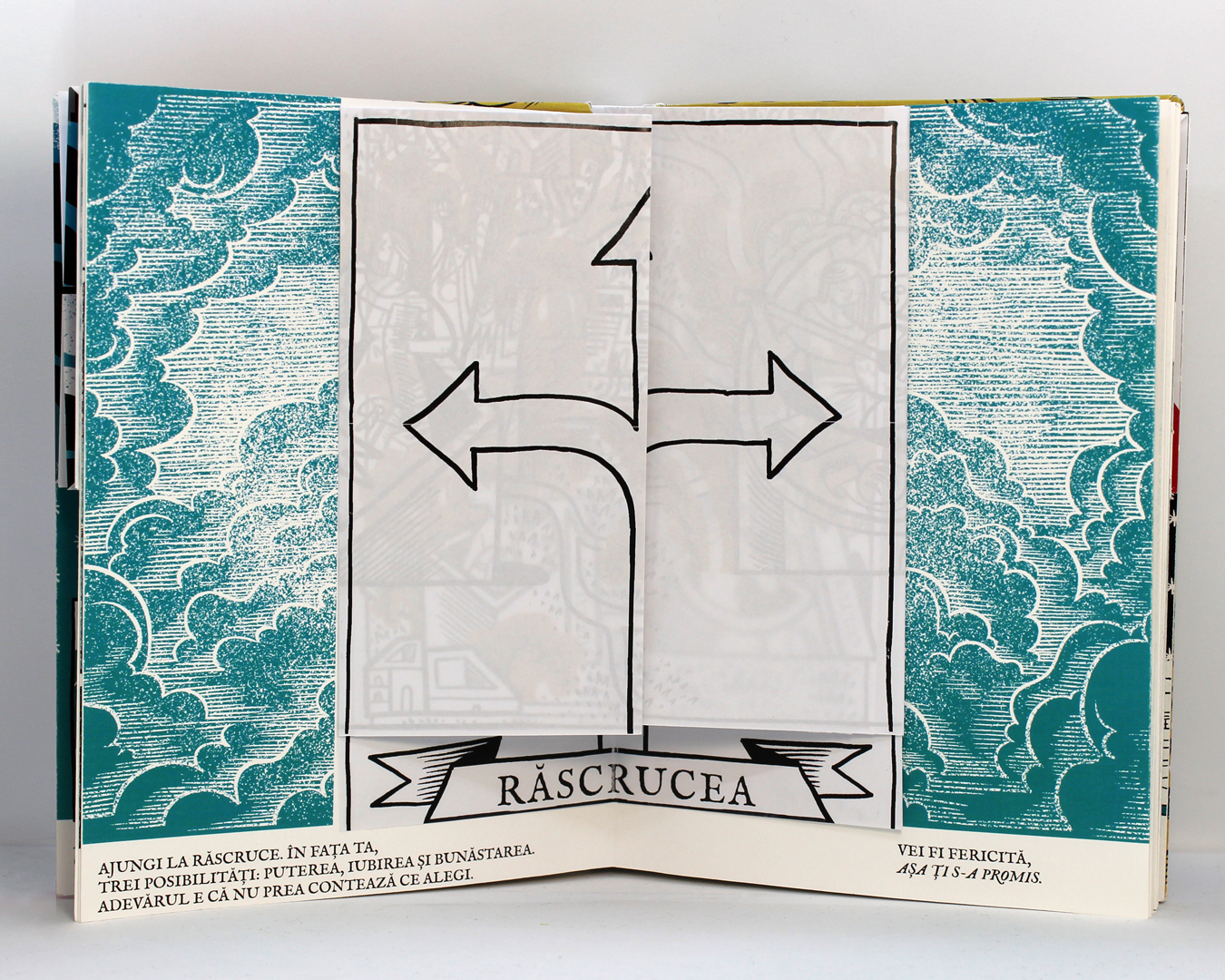
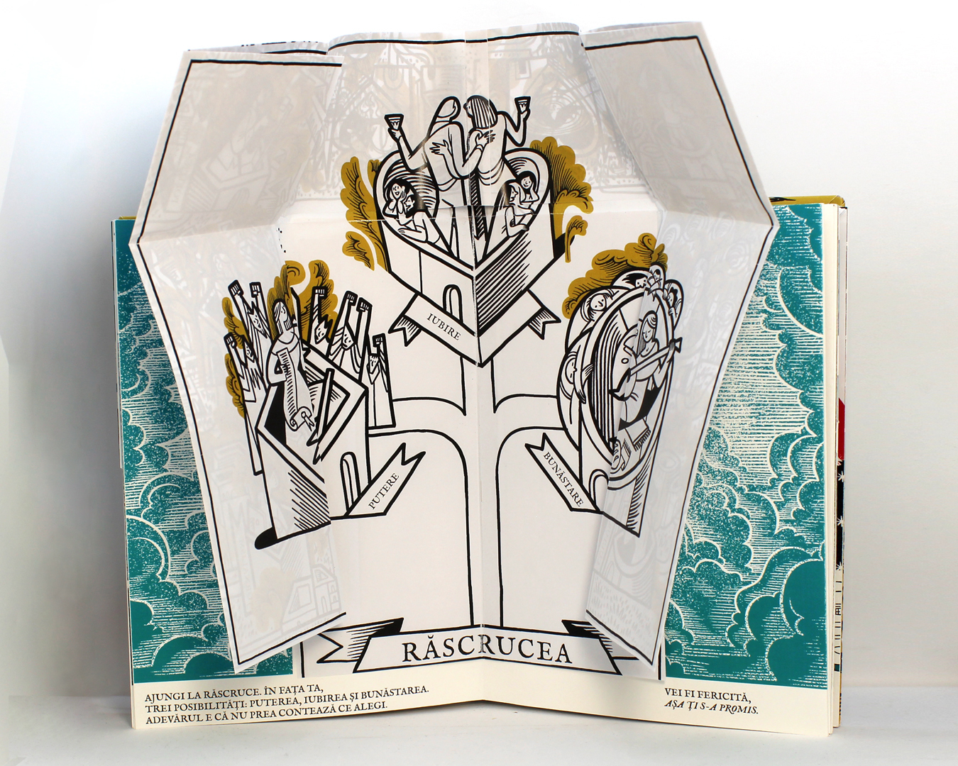
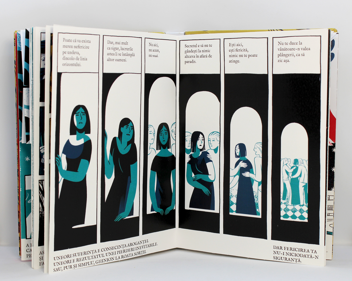
I also felt that my Romanian translation sounded strange, so I asked a real editor for help – Eli Bădică from Nemira, who had been one of the mentors on the creative writing course I took at Redepov. She pointed out several issues with the text, and noted that, since the book was neither a picture book, nor a comic book, the placement of the text should be consistent. This observation especially applied to page 11, there the narrative voice was, for the only time in the book, confined both the the upper part of the panels and the text space at the bottom. She also wondered why I was providing the illusion of choice – if the reader engaged with the map, and made a choice between love, comfort and power, that choice would be negated on the next page, where I was forcing ”love” on them anyway. This was a good observation, and something that had been in the back of my mind.
Armed with this knowledge, I moved on to prototype 5.