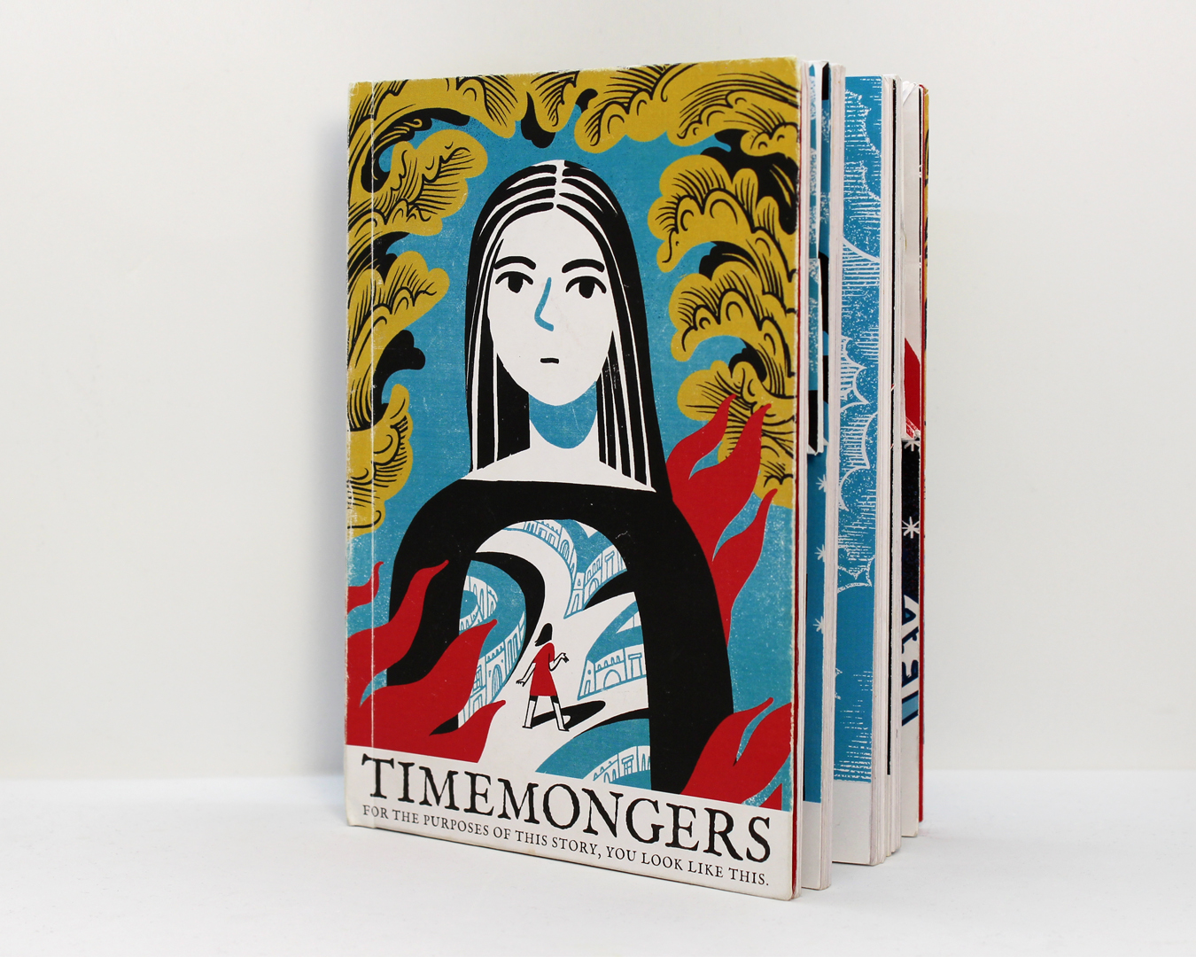
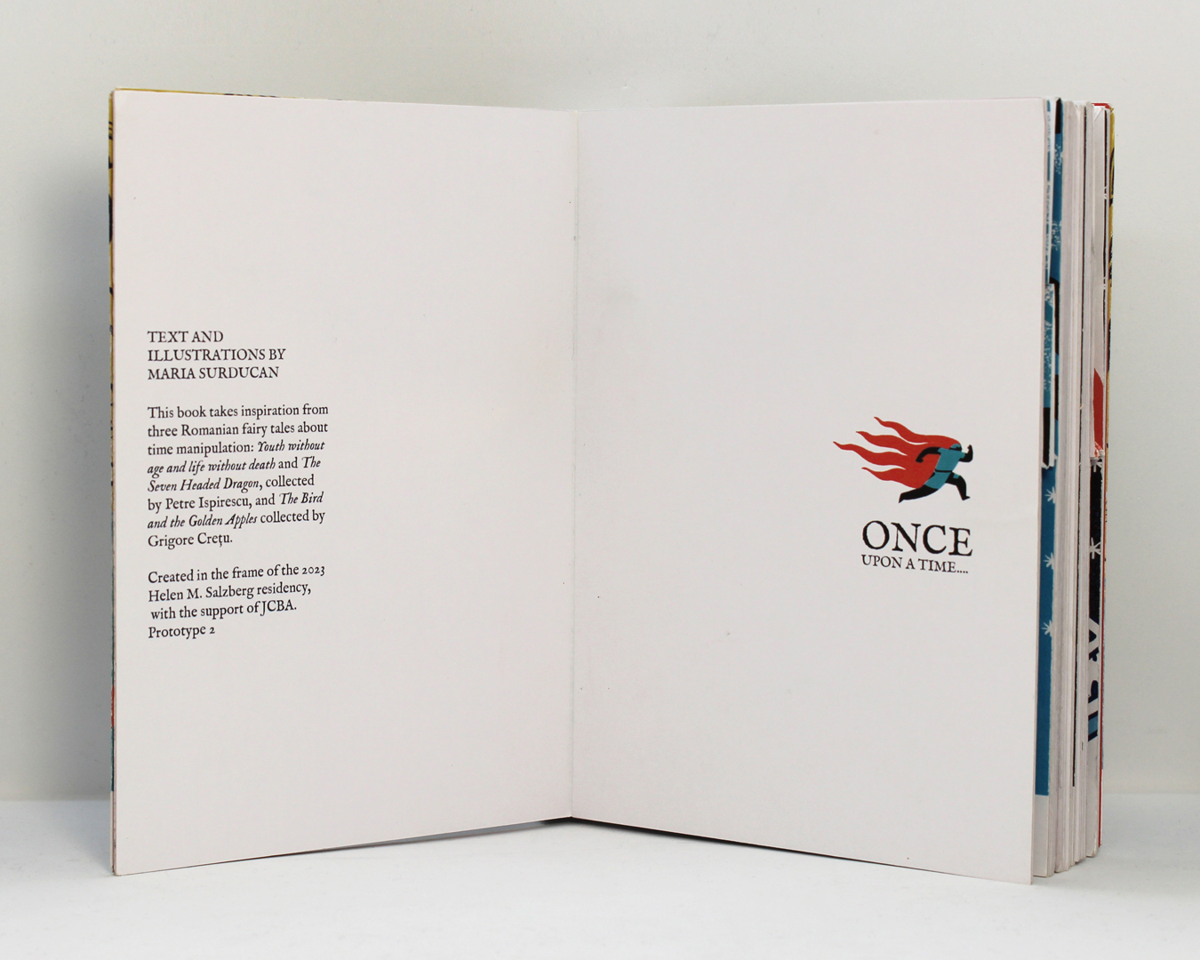
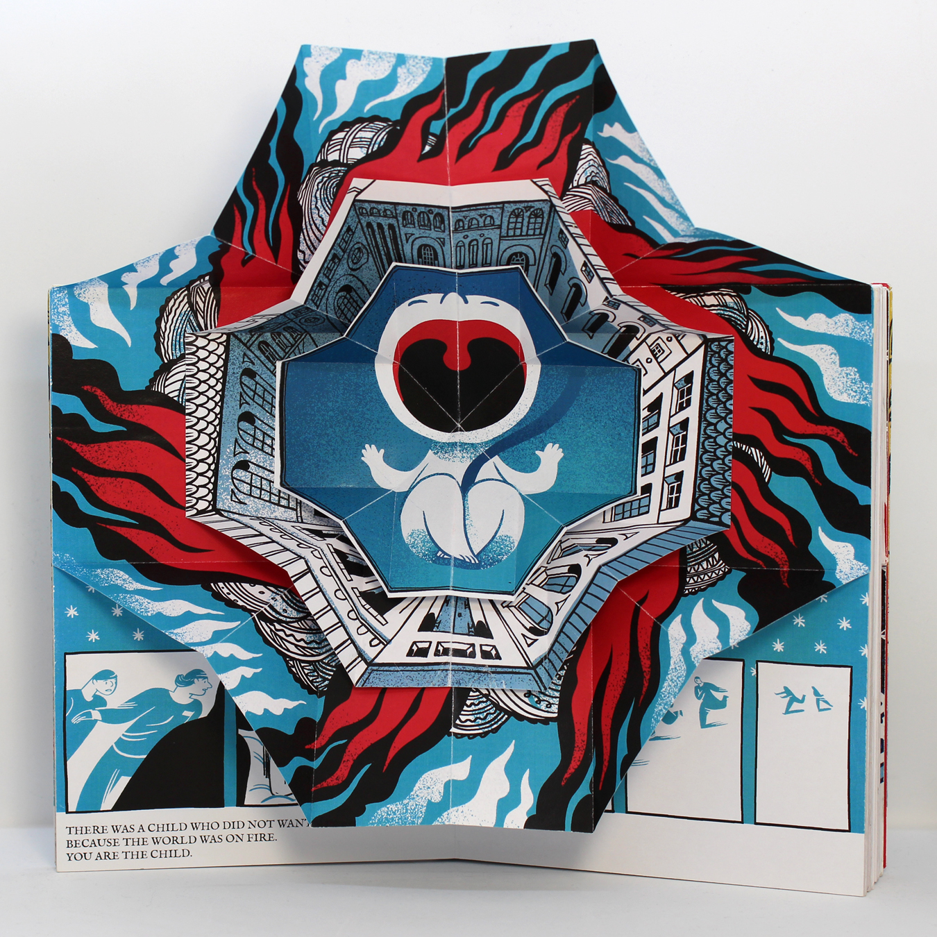
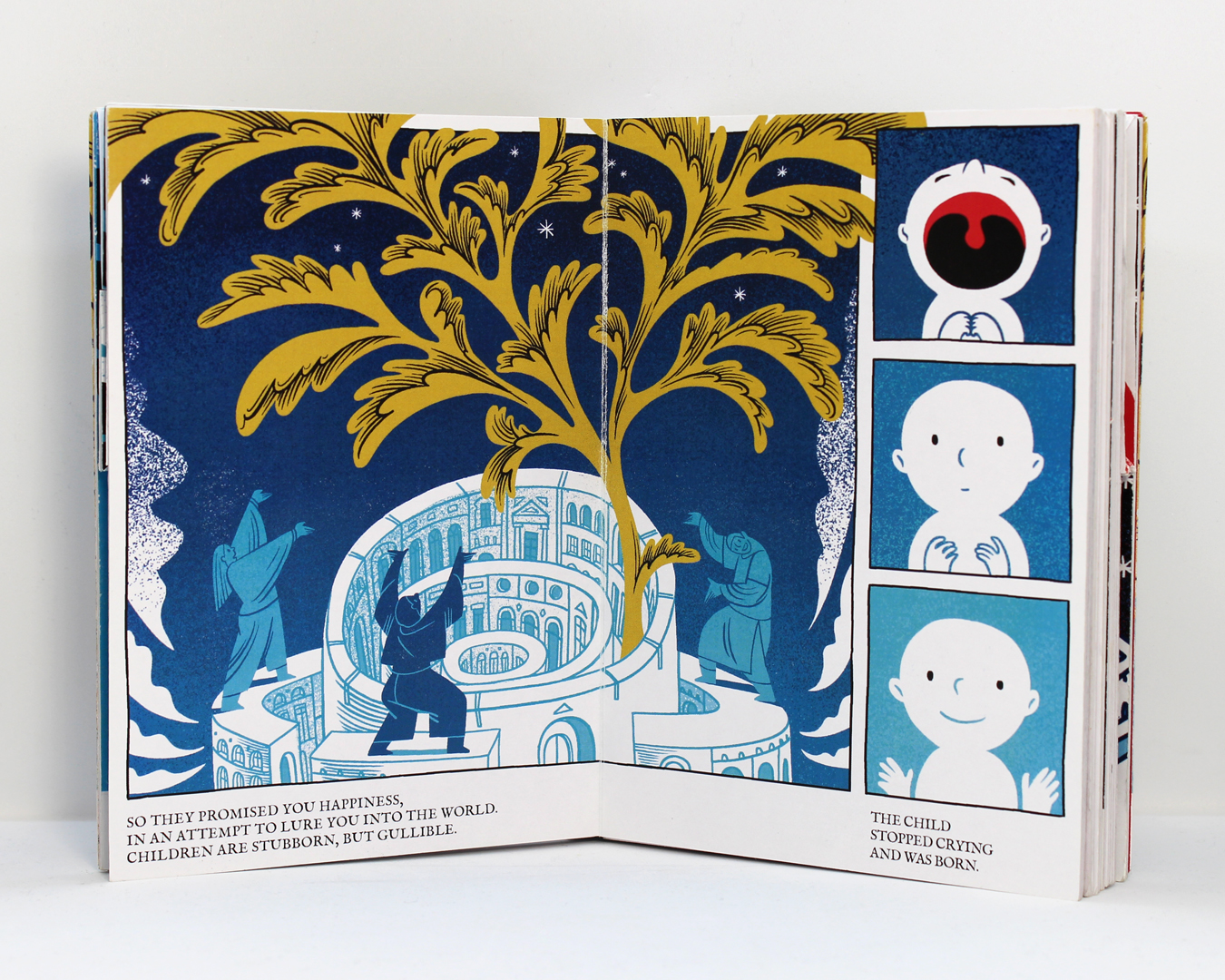
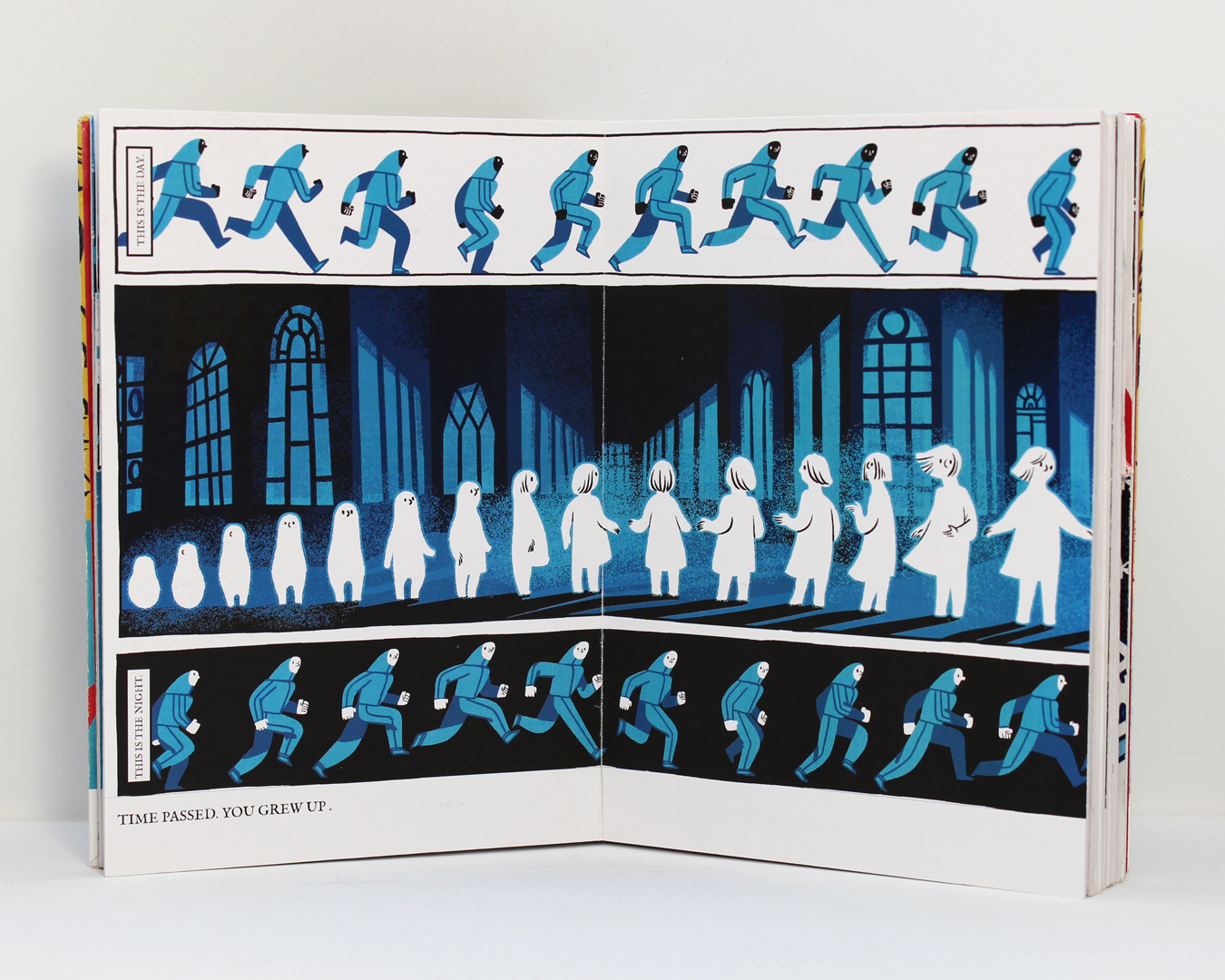
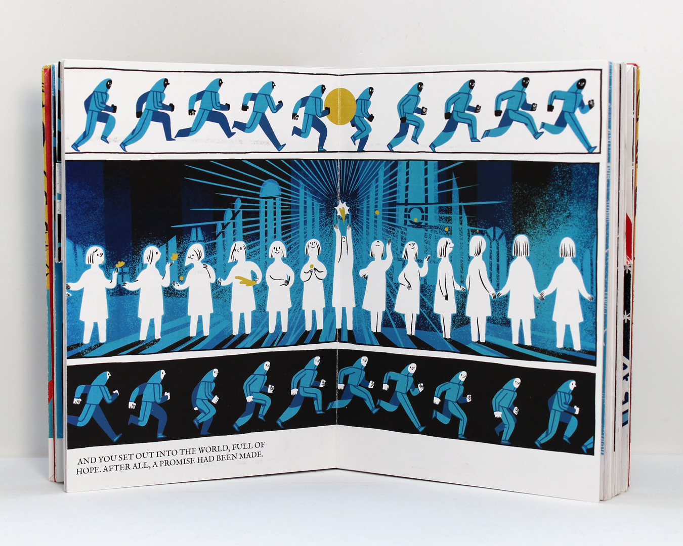
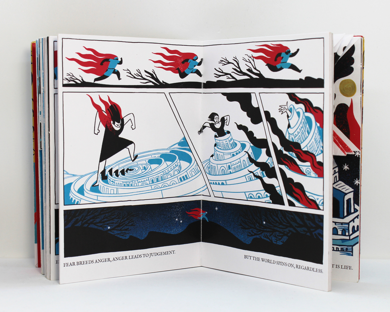
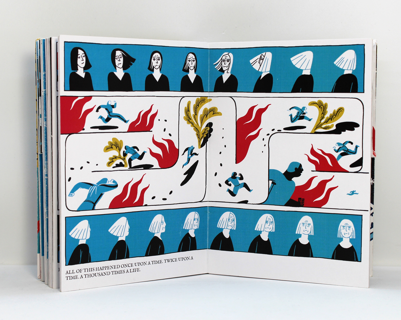
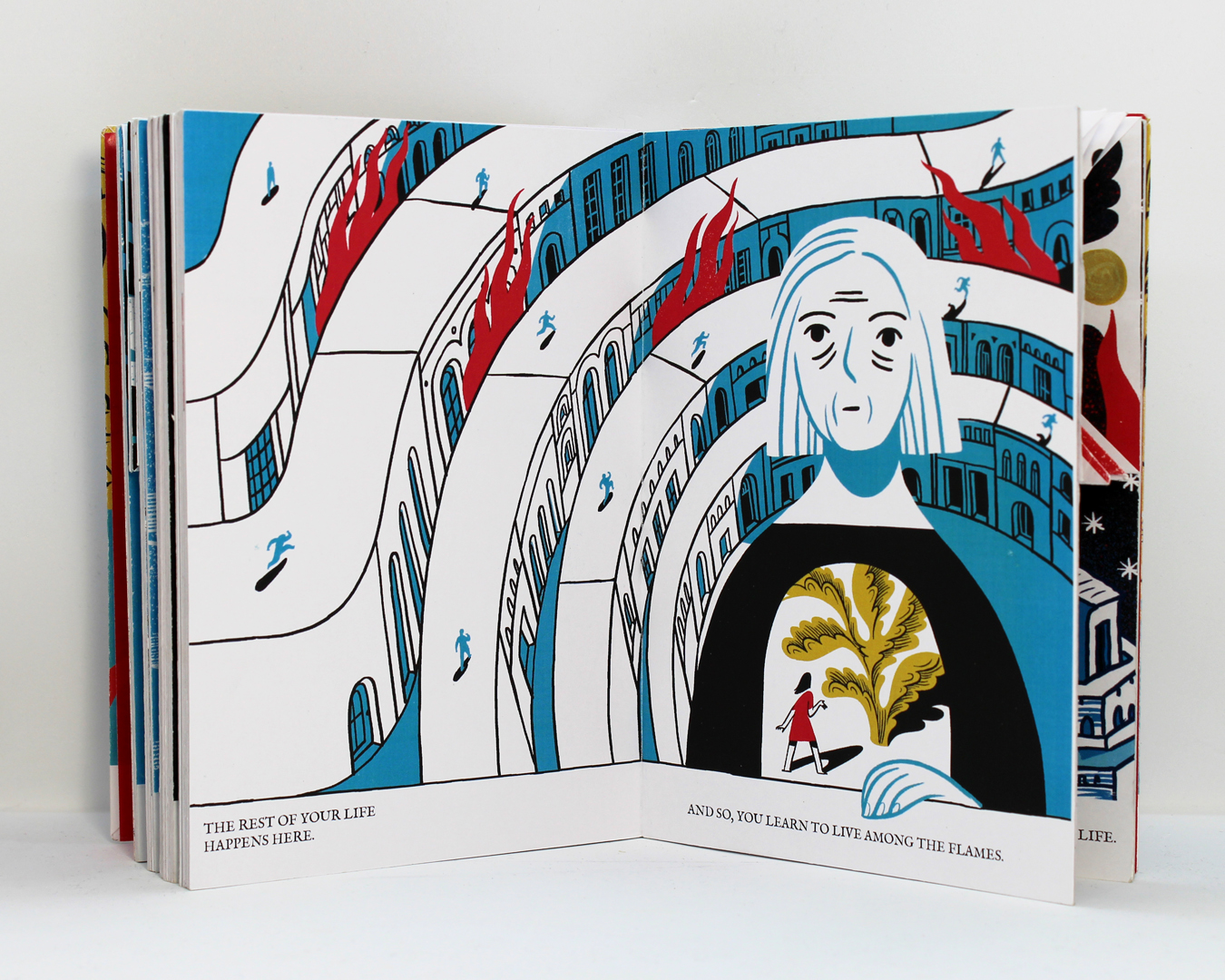
For the second prototype, the most important goal was to finish all the illustrations. As a technical restriction, I decided to work only with five colours (black, two shades of blue, red and gold). Gold was supposed to represent happiness, while red would be suffering/fire. The composition for most of the images had already been established with the first prototype, and I knew I wanted to stay closer to comics than to illustration.
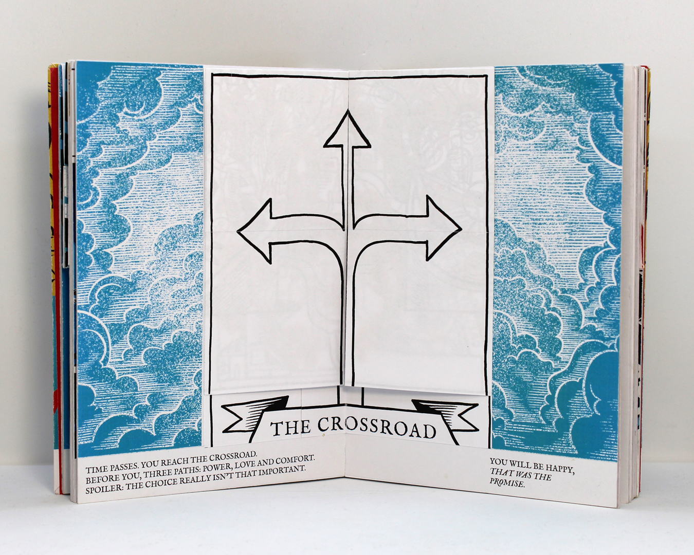
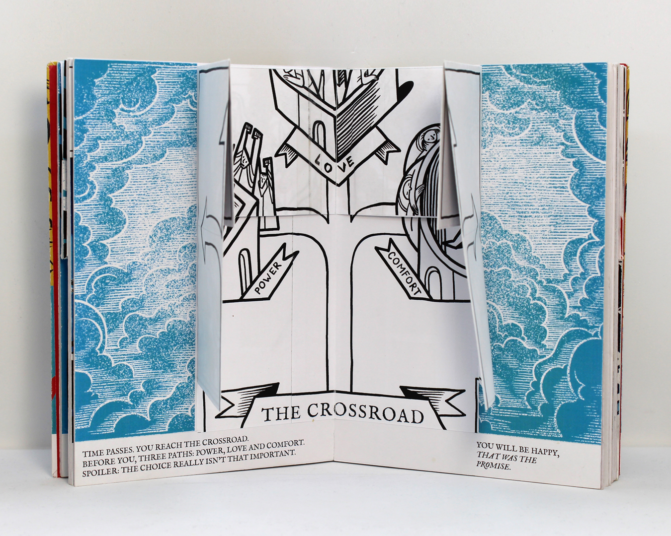
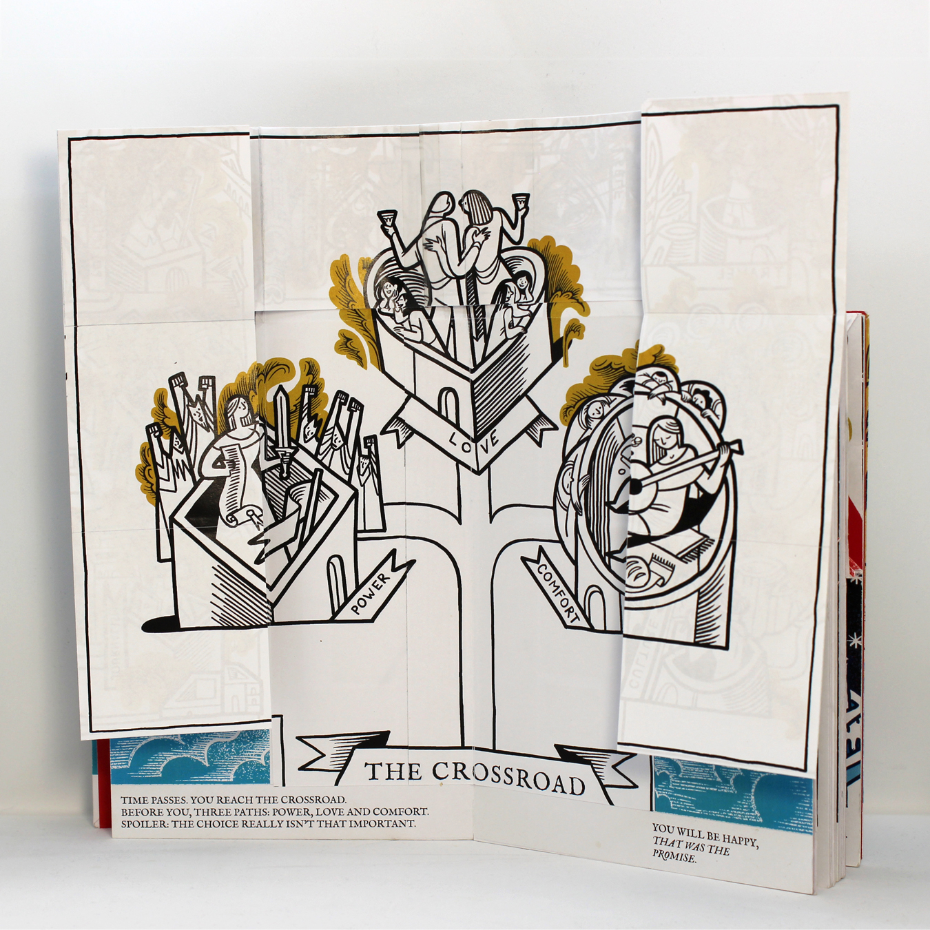
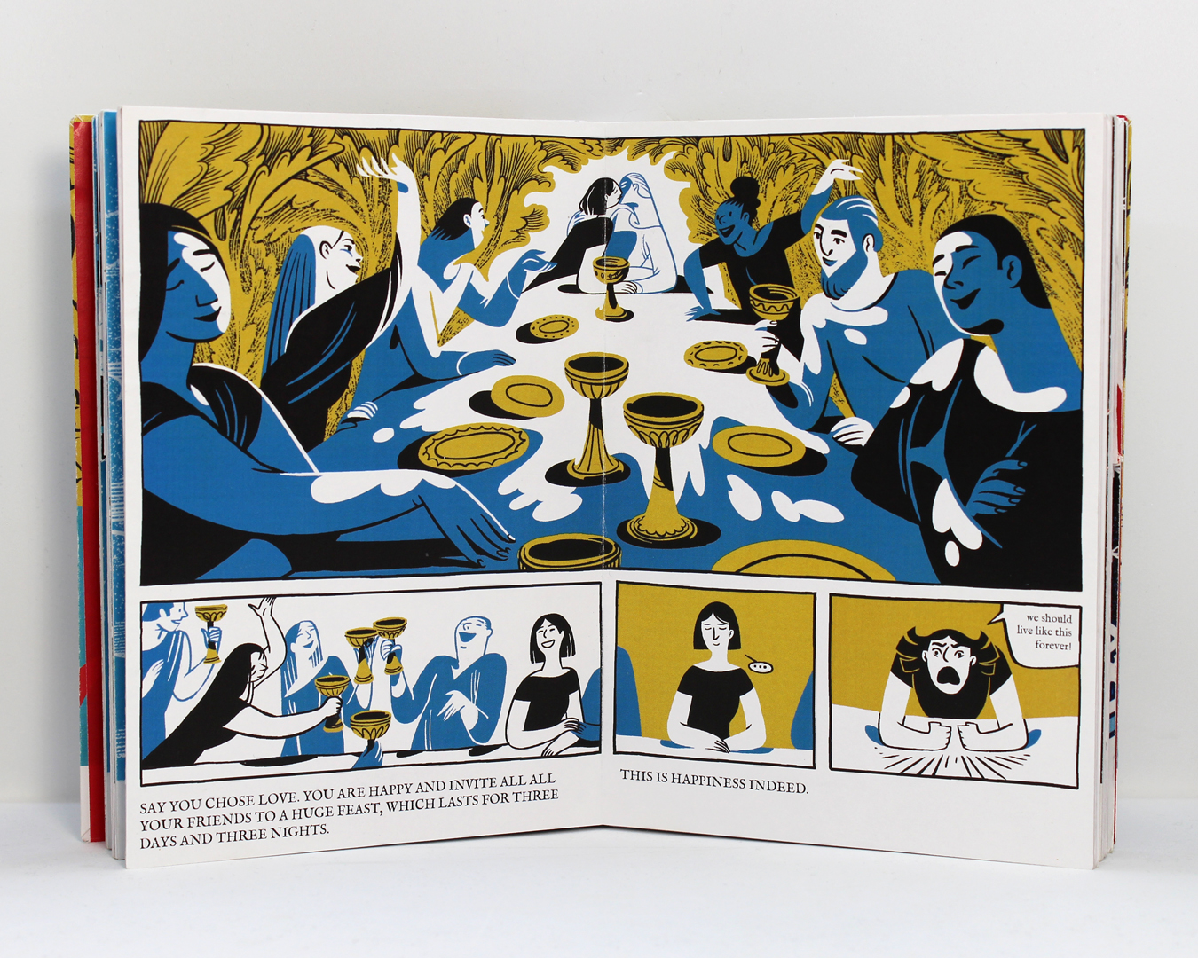
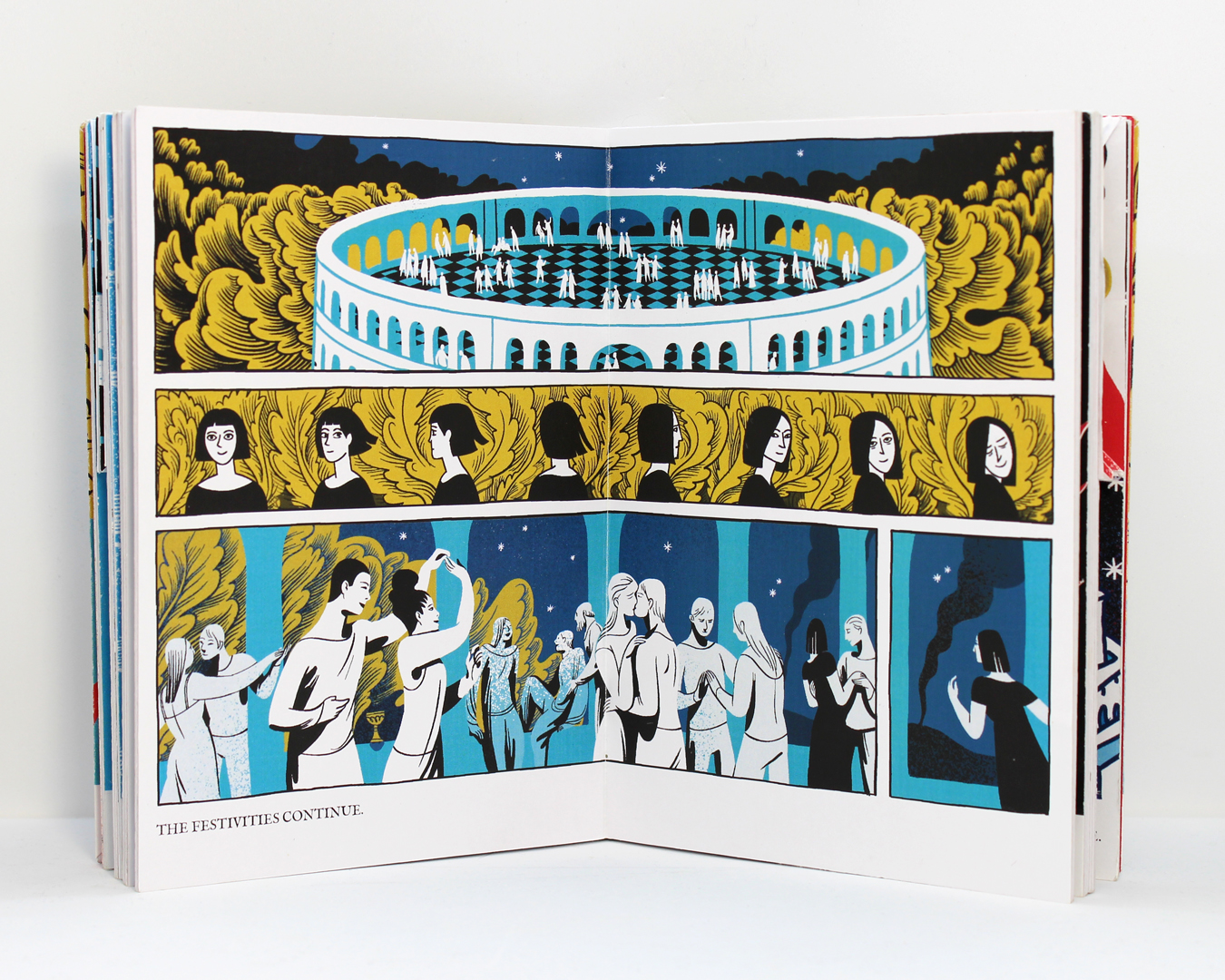
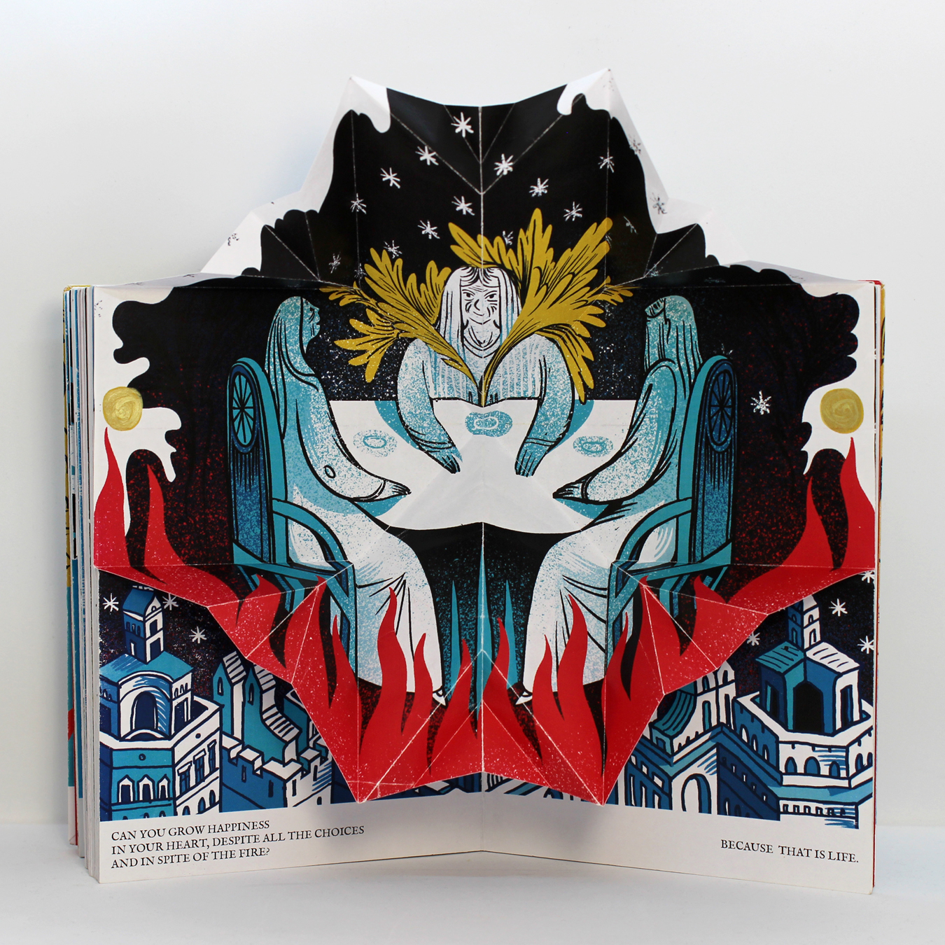
I reprized the symbols from the concert and tarot deck – cups for love, sword for power, bread for comfort. Since the book had a linear structure, I had to force a choice on the reader. Love had proven o be the most popular choice in live concerts, so the characters were presented feasting in paradise from golden cups.
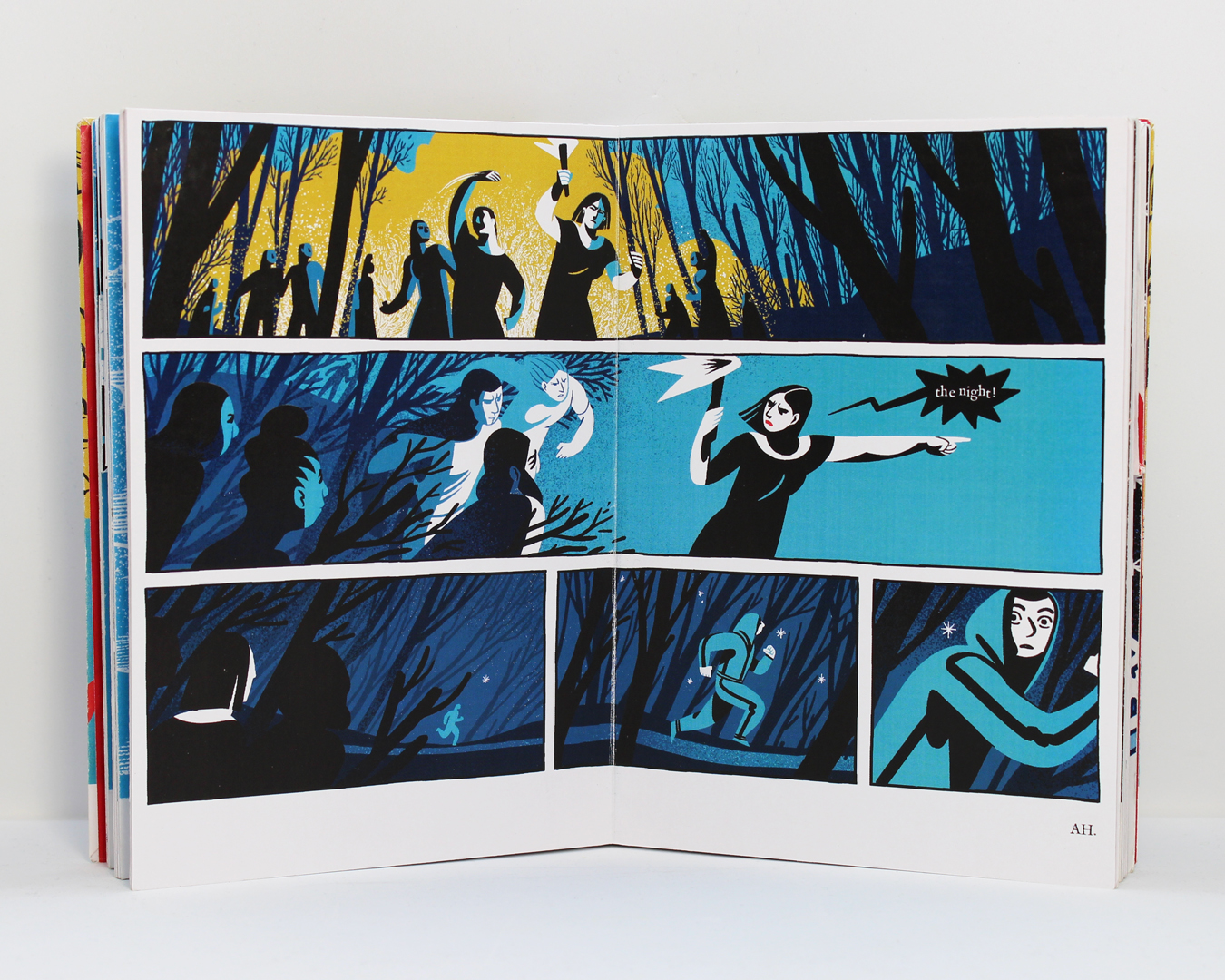
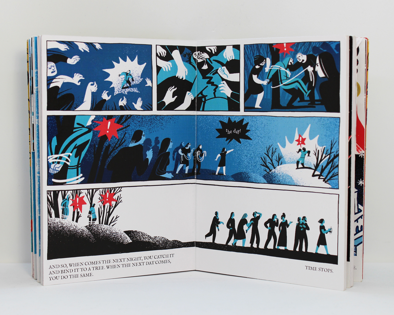
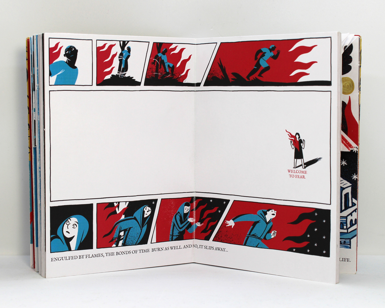
I reached out to Miki Montlló for advice on the composition of the chase scene (action scenes have never been my forte) and changes a few camera angles.
With all images finished, I moved on to print and production. I discovered that it was impossible to print at home on parchment paper, as it was too thick for my Oki C844 laser printer. I printed all the pages on self adhesive A3 paper, glued them to 400g cardboard, then glued the cardboard pages together. The idea was to have something similar to the board book bindings used for picture books, which would provide a rigid back for the pop-ups. The 400g paper I used was the A3 KOH-I-NOOR Pop Acrylic, since I had already used it for the concert. In addition to being rather expensive, that particular brand of paper completely disappeared from the Romanian market in the course of 2024. I also encountered the long running issue of the laser print cracking at the centerfold, this producing a faint white line.
The result was a very sturdy book, with a 3.5 cm spine. This seemed excessive, so at this point I started to investigate realistic options to either print the book myself or outsource the printing part of production and just concentrate on assembling the pop-ups.
As a side note – this is the last appearance of the sun, spread six. My sister pointed out that either it was there to signal that ”it was day”, case in which we needed to also see the moon, or, since it was yellow, it was there to symbolize happiness, case in which it was taking the spotlight away from the little star the girl holds. So I got rid of the sun.